Muupi
 LAD Awards2026
 The Dieline Awards2025
Context
In Brazil’s children’s gummy market, brands tend to pick a side: functional strength that reassures parents, or fun that wins over kids. Few manage both, and fewer build a story that lasts beyond the label. Muupi starts with an advantage, inheriting from Booma the characters children already recognize and the trust families already have. What it had to change was a familiar scene in homes with children from age two: the daily argument over taking a supplement.
Concept
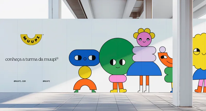
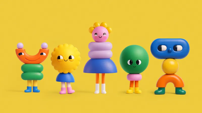
Health joined the game. A child’s day is made of jumping, running and inventing, and Muupi doesn’t ask them to pause it. It gives the routine a character, a story and a set time, so care becomes something a child asks for instead of something a parent has to insist on. Each launch adds a new friend to the gang, and the habit grows with the collection.
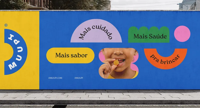
Verbal Identity
Muupi speaks on two frequencies: the same sentence entertains the child and informs the parent. Its personality is part jester, part caregiver, light enough to lift the weight of the routine and serious when the subject is health. It explains what each product does in the family’s own language and leaves out what the category often leans on: label jargon, forced cheerfulness, fear and guilt. Its vocabulary belongs to the brand, from “the gang” to #HoraDoMuupi, a new ritual for every home.
Visual Identity
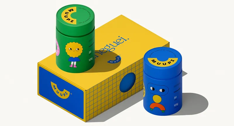
Everything is built like a toy piece. Simple geometry becomes characters, patterns and type, so any new product or story can click into place and make the universe bigger. The smile-shaped logo holds it together, from packaging to campaign.

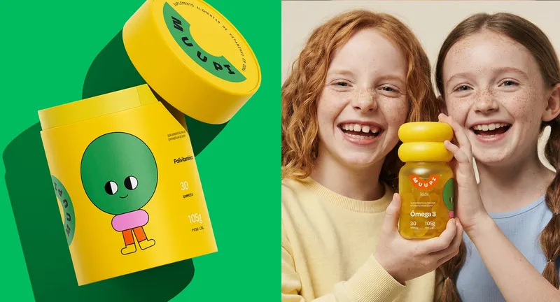
Packaging
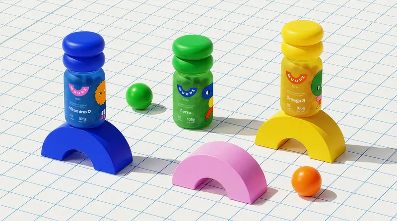
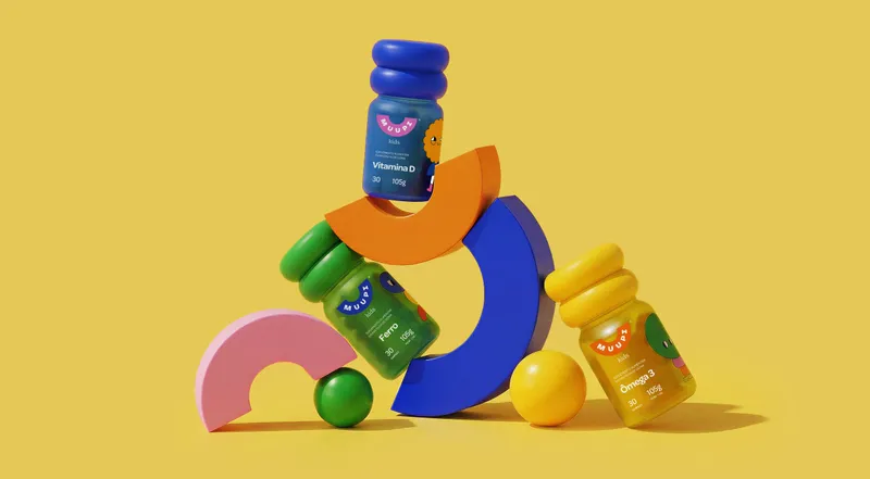
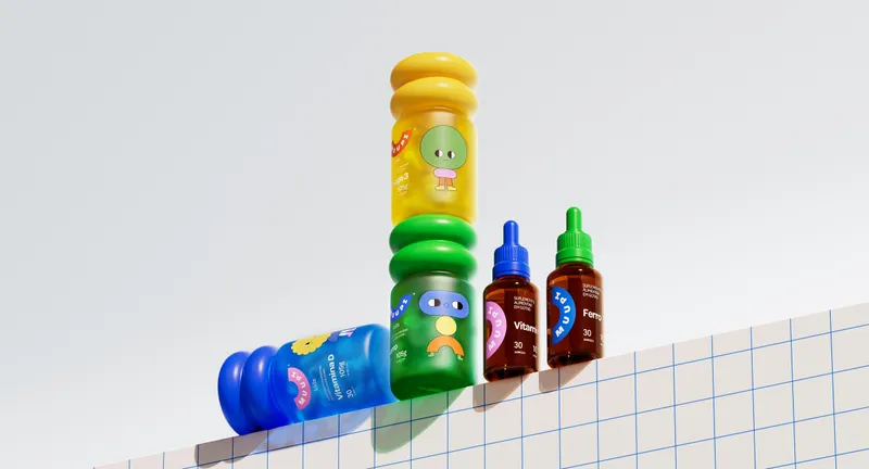
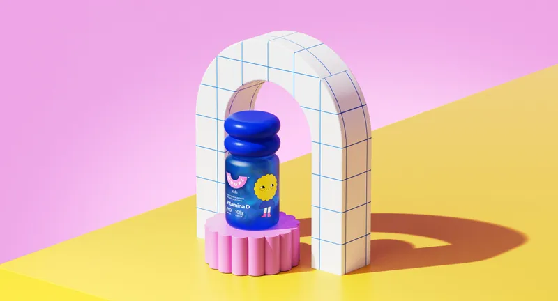
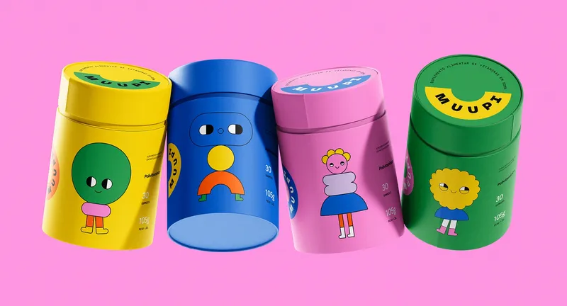
The pack splits the conversation. The front talks to the child through a character, a color and an invitation. The back talks to parents through function, composition and directions for use. Rounded, sculptural bottles bring the characters into three dimensions, turning each supplement into something to recognize and collect.